
Problem:
In a world where life and work move faster than ever, around 60 percent of Americans feel they do not have enough hours in the day to complete their to-do lists. As we overload our schedules, we erode personal boundaries and may suffer from Busy Brain Syndrome, leading to poor decision-making, inefficient time management, and irritability.
We embarked on a journey to design a productivity app that provides simple yet innovative features to be used by students and working individuals who are always busy.
Solution
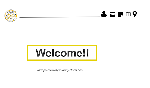
We created Busy Bee, a productivity app specifically designed for personal organization with innovative features, emphasizing time efficiency and proactive scheduling.
My Role
Facilitated all project meetings as team lead
Conducted user research
Designed Mid-Fi and Hi-Fi prototypes
Conducted user testing
Timeline
Total: 11 weeks
Tools
Axure
Canva
Teams
Overview & Design Principles
Overview
The goal of Busy Bee is to help users juggle the multiple roles they have within their lives, not just one aspect. It is an application designed to enhance organization and productivity by effectively managing tasks and schedules. It offers seamless synchronization between users' computers and smartphones, providing an intuitive interface for organizing errands and appointments based on their respective locations. This application aims to revolutionize task management and daily navigation, catering specifically to the needs of busy individuals.
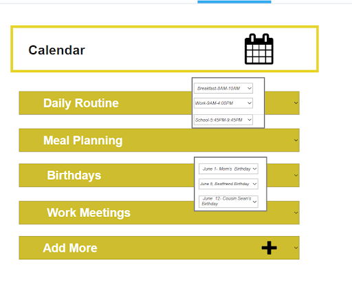
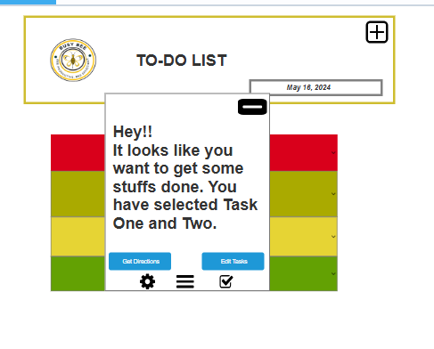
Implement features to prevent users from overbooking themselves, ensuring a balanced schedule. Creates a daily To Do list.
Organize tasks with a color-coded system from most urgent to least urgent for quick visual reference.
Send notifications on multiple platforms.
Ability to make suggestions for locations to complete tasks based on user preferences.
Allow users to customize their preferences and settings to best fit their unique schedules and lifestyles.
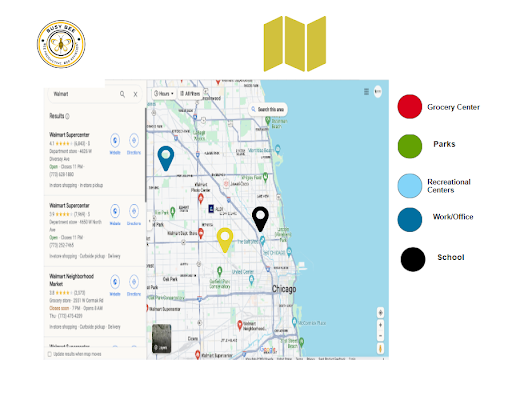
For errands, it provides the most effective way to navigate to multiple locations based on preferred transit method.
Competition Analysis
Current tools like Trello, Microsoft Teams, Outlook, and Waze address organizational needs but fall short in personal time management:
Trello lacks proactive notifications.
Microsoft Teams offers minimal task alerts.
Outlook & Calendar risk overbooking and lack habit-learning features.
Waze focuses on navigation but doesn’t prioritize efficient, multi-stop planning.
Busy Bee bridges these gaps by combining personal organization with innovative features, emphasizing time efficiency and proactive scheduling.
Design Principles
Busy Bee stands apart with these core design tenants:
Intuitive Interface: Seamlessly sync across computers, smartphones, and CarPlay for a unified experience.
User-Centric Customization: Adapts to unique lifestyles with personalized settings and habit learning.
Holistic Life Management: Suggests efficient task completion strategies and time management tips.
Efficient Errand Navigation: Optimizes routes by task priority or transit preferences.
Key Features
Overbooking Prevention: Maintains balanced schedules.
Color-Coded Prioritization: Highlights urgent tasks at a glance.
Cross-Platform Notifications: Ensures timely reminders across devices.
Personalized Task Suggestions: Proposes locations and methods for completing errands.
Dynamic Errand Routing: Tailors navigation for multiple destinations.
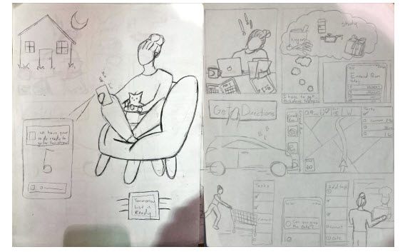
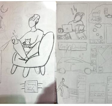
Design Charrette & Sketches
We began with sketches depicting user scenarios like grocery shopping or balancing work and school deadlines. Through iterative testing of rough mockups, we refined workflows and resolved pain points before moving to a functional prototype.
A mood board guided our branding and ensured cohesive design elements that resonate with users' needs.
Ideation
Mood Boards
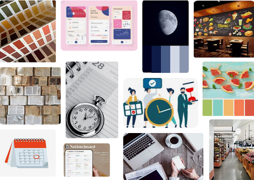
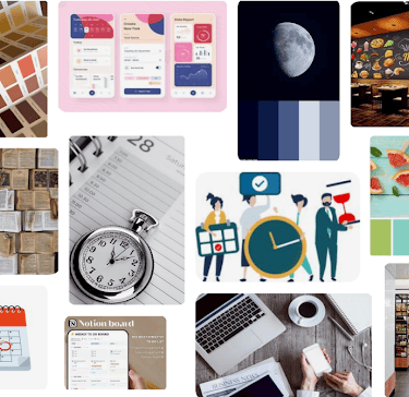
As we started making changes to our application, we adjusted the mood board to fit what we were going towards. We changed out the color theme to go with the bee color idea. Then we changed the focus to more to do lists and navigation, so we added more image to relate to that.
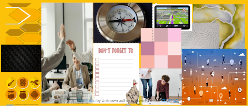
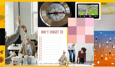
In the first version of the mood board, we went with pink bright summery tones and focused on time management. Finding things to-do with clocks and calendars.
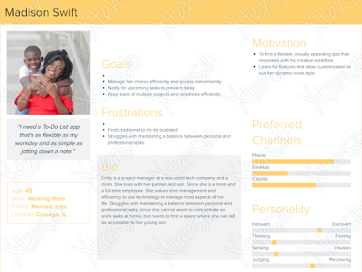
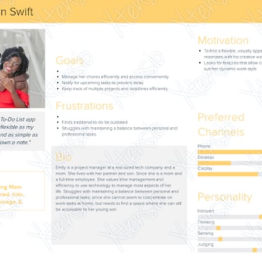
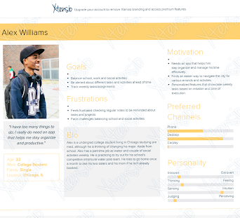
Personas

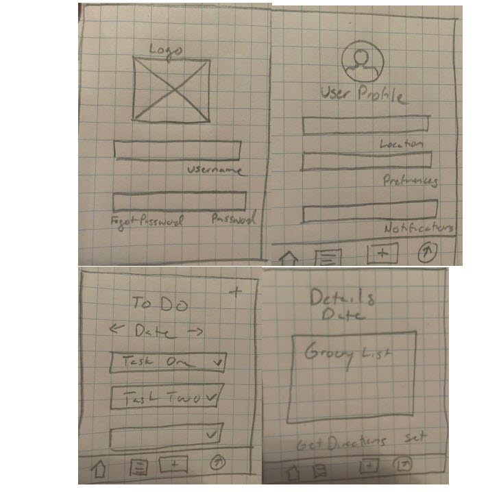
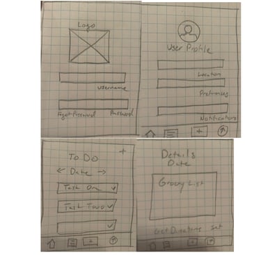
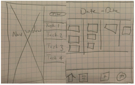
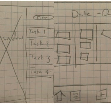
Mid-Fi Prototypes
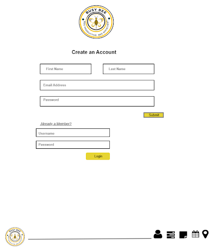
The team used Azure to create a Mid Fi Prototype to be used during the usability tests. This is so the test users would have a more realistic interaction with the product while still allowing the team enough flexibility to make changes to UX design, formats or flows based on user feedback.
App Usability Testing
Purpose:
Our mid-fi prototype was tested to refine features, identify overlooked issues, and improve user experience before advancing to the high-fidelity stage.
User Testing Protocol
Testing Objective:
Evaluate app usability for busy urban users juggling work, education, and personal life. Focus areas included:
Cross-platform navigation (mobile, desktop, CarPlay).
Task organization and prioritization.
Directions and mapping features.
Test Groups
Urban Millennials: Professionals or students managing hectic schedules.
Young Professionals: Early-career individuals balancing work and social obligations.
Working Parents: Managing household tasks and children’s activities.
Sample Tasks Tested:
Profile Setup:
Add household members with specific permissions.
Configure notification settings for shared and personal tasks.
Task Management:
Add and categorize tasks.
Use the calendar to view weekly priorities.
Errand Navigation:
Plan efficient routes for multiple locations.
Switch seamlessly to CarPlay view.
Branding & Style Guide
Logo
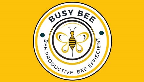
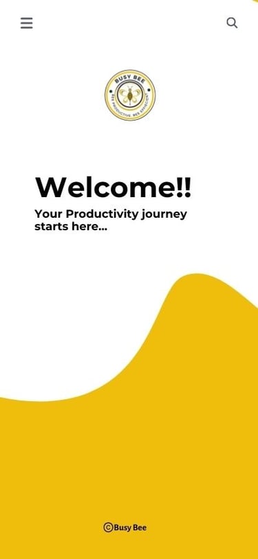
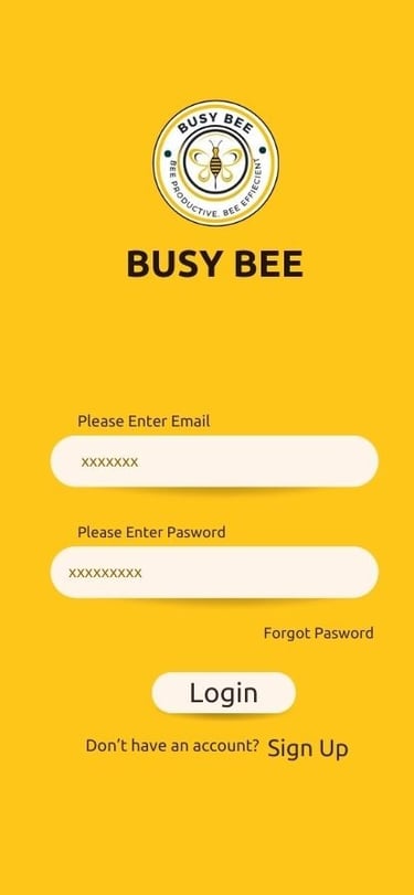
A designer’s childhood nickname, “Busy Bee,” inspired the energetic theme of our app. The warm, exciting yellow color promotes productivity and positivity. The bee icon serves as a nostalgic nod to the designer’s parents’ affectionate nickname, complementing our mission statement: “Bee Productive, Bee Effective.”
Color Palette
We curated a vibrant color palette to sustain users' motivation throughout their task journey. Additionally, we selected high-contrast colors to ensure easy readability from a distance or on smaller screens.

Findings
Top Issues & Recommendations
1. Calendar Usability
Issues: Difficult navigation with dropdown menus | Lack of clear task categorization.
Solution: Redesign calendar similar to Outlook: 24-hour view, color-coded categories, and reduced clicks.
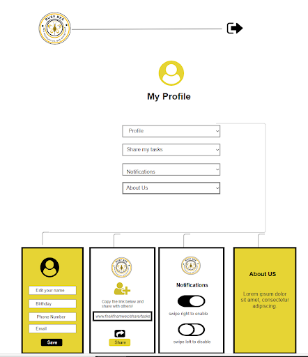
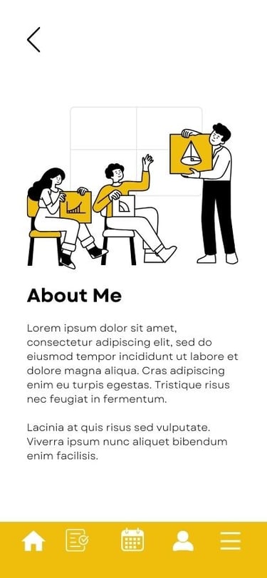
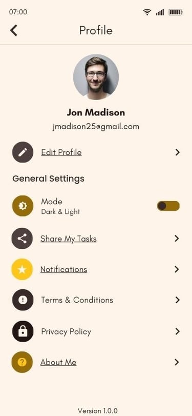
2. Profile Customization
Issues: "About Us" tab unclear | Limited options for task visibility and user roles.
Solution: Rename to "About Me" and add: Personal preferences for frequent locations (e.g., grocery stores) | Role-based access settings (admin, editor, viewer).
3. Notification Settings
Issues: Overwhelming real-time alerts.
Solution: Add options for consolidated daily notifications or real-time updates.
4. Mapping Features
Issues: Limited route customization.
Solution: Add route preferences (fastest, shortest, task-prioritized).
Reflections & Next Steps
The Busy Bee team will:
Conduct additional user tests to refine the calendar and navigation features.
Improve customization options for profiles, notifications, and household roles.
Develop HiFi prototypes to provide realistic, interactive user experiences.
Hi-Fi Prototypes
After we did testing and made our first adjustments to the Mid-Fi app we decided to make the rest of the app on another application. We as a team were not very conformable with Axure and wanted to get the app designed out in another program we liked better, so we switched to Figma.