
Problem:
Temu: Temu is an online shopping platform that offers a variety of products ranging from clothing to accessories to kitchen appliances, etc Serving over thousands of customers, the platform is relatively affordable compared to its competitors. However, the website seems to be overcrowded with pop up ads and overload of i formation -resulting to users distraction and confusion.
We aimed to assess the current architecture of Temu’s mobile and desktop website and understand the user’s needs in order to restructure and ensure seamless navigation on the site.
Solution:
My team, through various information architecture evaluation methods, created and proposed an updated information architecture for Temu’s website detailing the process in the final report.
My Role
Facilitated most of the teams meeting as a lead
Drafted the project overview
Formulated the free listing
Created the treejack testing and analyzed the results
Timeline
Total: 11 weeks
Tools
Optimal Workshop
Figma
Canva
Google Docs, sheets
Overview
Temu is an online shopping platform that offers a variety of products ranging from clothing to accessories to kitchen appliances, etc. Temu stands out as one of the cheapest sites compared to its competitors: Shein, Wish, etc. Temu site (https://www.temu.com/) has experienced rapid growth with users purchasing a diverse range of products. The site, although known for affordable product pricing, seems overcrowded with lots of pop-up ads and sales features when navigating.


Context & Goals
Restructure Information Architecture: Streamline and reorganize the site’s content to make it more user-friendly and intuitive.
Synthesize Contents: De-clutter the website by categorizing and organizing products effectively, reducing the overwhelming nature of the current design.
Enhance User Flow: Create a seamless navigation experience, allowing users to find and purchase items quickly without distractions.
Improve Navigation System: Introduce clear and obvious navigation indicators, simplifying the process of reaching desired pages or product categories.
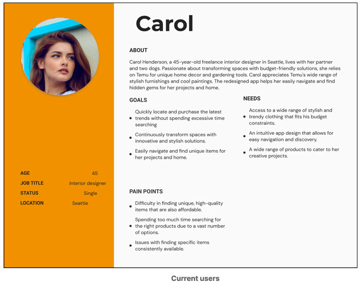
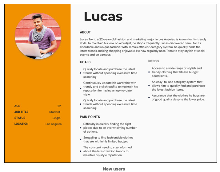
Personas
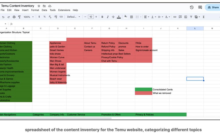
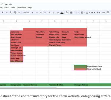
Content Inventory
Purpose:
To gain a comprehensive understanding of the website's components and evaluate its structure, we conducted a Content Inventory. Process: Scope
Definition:
We included the primary navigation and any clickable navigation within the site pages in our content inventory Structure Establishment: We analyzed the original site's structure and created a list of cards based on the site's naming conventions Internal Open Card Sort: Our team conducted an open card sort to ensure alignment within the group Finalization: After aligning our results, we finalized the "categories" and cards for a card sort.
What We Learned:
Repetition Issues: We identified several repeating pages in both the navigation and the homepage, leading us to question their necessity.
Category Optimization: We questioned the need for the current number of categories and considered condensing or reorganizing them for better clarity and usability.
Card Sorting
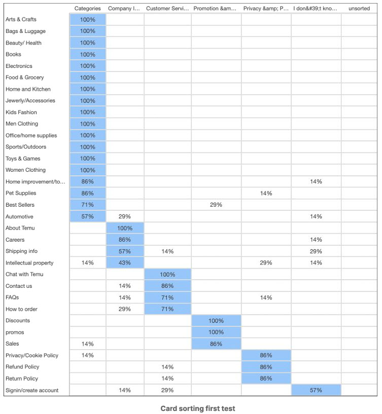
Card Sort #1:
To better understand how participants grouped our topics and test the validity of the categories, we also conducted a hybrid card sort to determine if there were better categories.
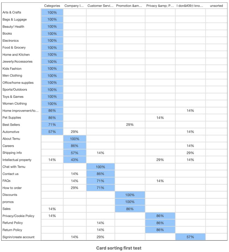
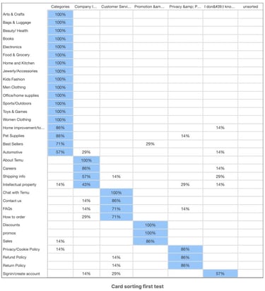
Insights from the First Card Sorting
Primary shopping categories (e.g., Arts & Crafts, Beauty/Health, Books, Electronics) are consistently placed in the "Categories" section
Items like "Best Sellers" and "Automotive" have varied placements, suggesting users see them as fitting into multiple sections such as promotional and category
"Intellectual Property" and "Privacy/Cookie Policy" are placed across different sections, indicating confusion or disagreement about their categorization.
Card Sort #2:
To further prove or disprove our original findings.
Insights from the First Card Sorting
Adding more items like "Careers" and "Chat with Temu" under "Categories" suggests an effort to simplify the overall structure
Items like "Best Sellers" and "Automotive" have varied placements, suggesting users see them as fitting into multiple sections such as promotional and category
"Intellectual Property" and "Privacy/Cookie Policy" are placed across different sections, indicating confusion or disagreement about their categorization.

Treejack Testing
Purpose:
We conducted a treejack test to evaluate how users can easily find items in the content hierarchy, and gain critical insights into how they navigate the site and how intuitive the site's structure is. We had a total of 29 participants for the two rounds of testing.
Insights:
TheTreejack testing helped us identify which labels and paths users naturally gravitate towards when looking for specific items. By understanding these patterns, we can streamline its navigation, making it easier for users to find what they're looking for without feeling lost or frustrated.
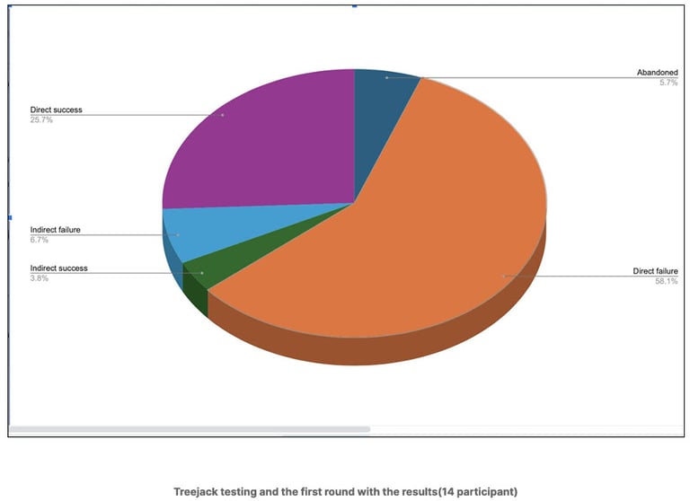
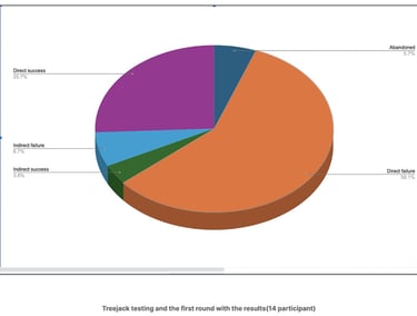
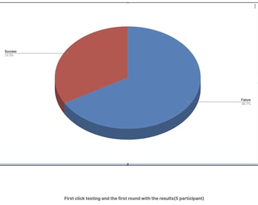
First round(14 participant):
We tasked participants about questions surrounding tracking orders, students’ deals, and home decor/ furniture. From our analysis, we had a 58.1% direct failure rate and success rate while three (3) 25.7% 5.7% of the participants abandoned some questions.
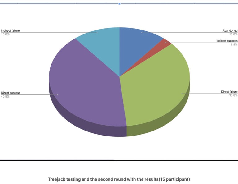
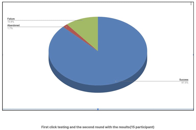
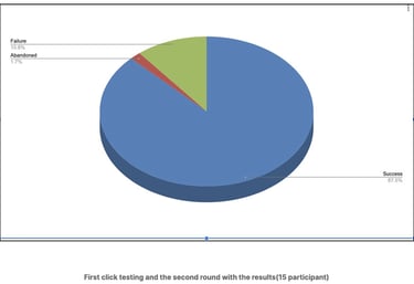
Second round(15 participant):
We made some changes and increased the questions. We tried to personalize the questions as much as possible to give the participants a clearer path to emotionally connect with the tasks. We asked questions surrounding item selection, deals, men shoes, product reviews, and conflict. With an increased of one participant in round two, we attained success rate and decreased in the failure rate as well.
First Click Testing
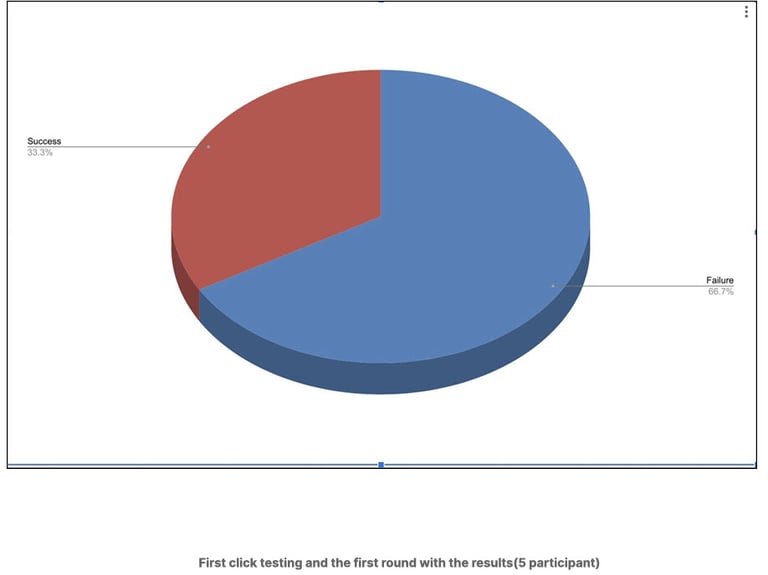
Purpose:
This interaction is crucial because it helps us determine the success of the task and the overall user experience. For Temu, where users often feel overwhelmed by the number of menus and sub-categories, first-click testing can reveal if the initial navigation paths are clear and logical. This helps us in restructuring the site to make navigation more efficient and user-friendly. If users know where to click first, they are more likely to complete their shopping tasks quickly and efficiently.
Insights:
From our two rounds of first click testing, we measured where users clicked first when given a task, providing insights into the intuitiveness of the site’s structure and navigation elements. The results showed which elements were easily findable and which ones confused users, leading to incorrect clicks, and where we could improve better.
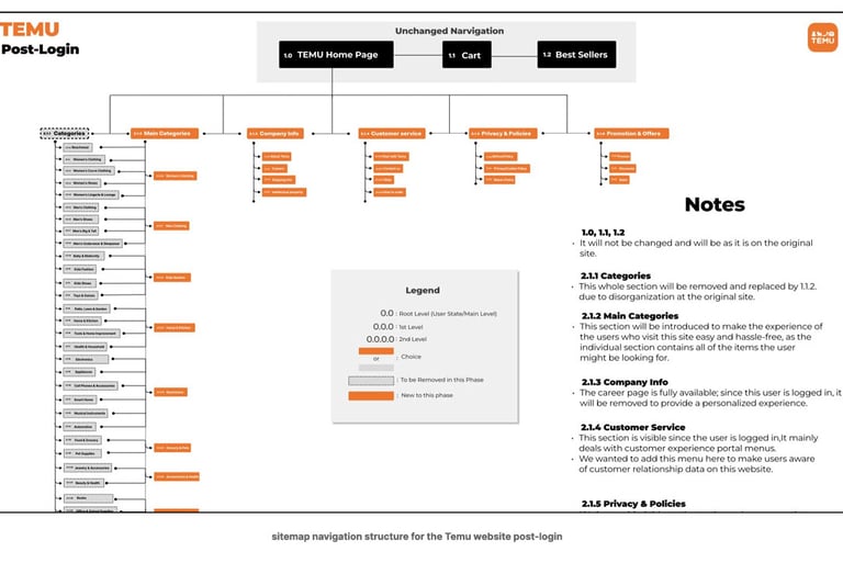
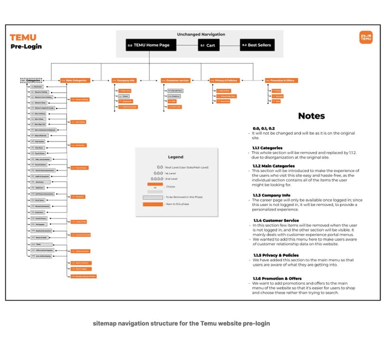
The Sitemap
For the original design, a lot of the categories have not been categorized correctly and some of the categories are just redundant. Based on the user feedback and testing, we have combined some of the sections into one big category. For instance, the original womens clothes were separate into 4 categories (eg. clothing,curve clothing,shoes, lingeries) which is unnecessary. By recategorized the categories we have made the web app more clean and minimal which produce a more positive user feedback.
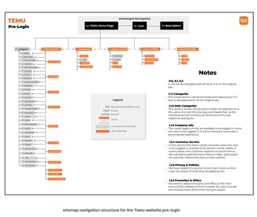
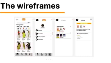
Purpose:
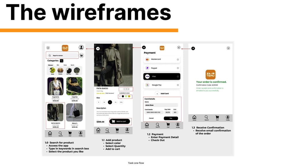
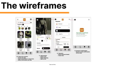
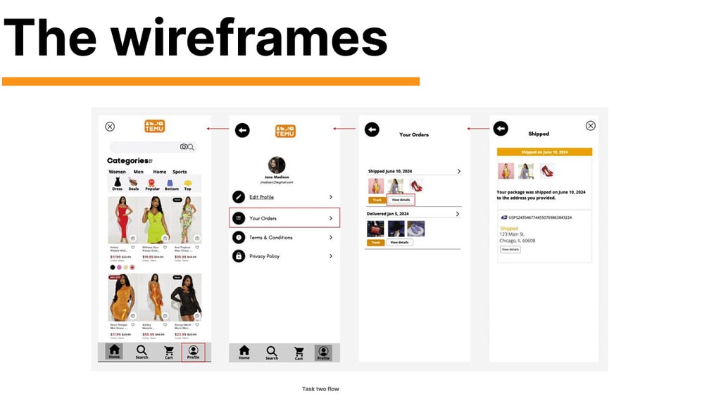
After our final sitemap was done, we created wireframes to help us test how users expect to navigate through the pages.
The proposed navigation structure for the Temu website includes changes to simplify navigation, enhance user experience, and improve organization. Users were asked to complete two tasks

Reflection :
The entire process, from proposal, content inventory, process flow to wireframing, sitemapping testing and designs- was a comprehensive journey aimed at deeply understanding and addressing user needs and frustrations on Temu’s site. Each step built upon the previous one, ensuring that our final design was grounded in user research and validated through iterative testing.
Key Takeaways:
How to check your order on TEMU
User-Centered Design: Designing with continuous user feedback was crucial for creating an intuitive and efficient site
Iterative Improvement: Each phase built on insights from the previous, underscoring the importance of iterative design Collaboration and Flexibility: Effective teamwork and adaptability to user feedback were essential
Data-Driven: Decisions based on data from various testing methods led to more reliable and effective architecture.